A reimagination of existing 3P Mac OS icons by Jim Nielsen
Jim Nielsen writes:
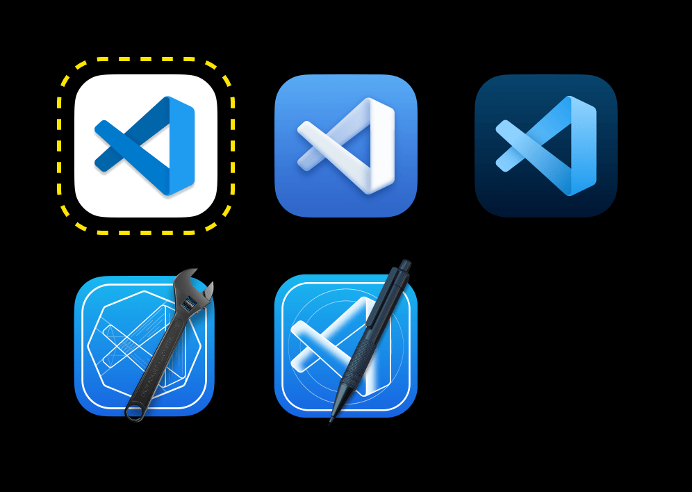
And there are some VSCode alternatives that explore both 1) going beyond a logo on a white background, and 2) providing dimension while borrowing from the visual language for Apple’s native development tool (Xcode).

For example here’s Outlook:

The Big Sur-ification of macOS Icons - Jim Nielsen’s Blog
Visual Studio explorations really are the best. And the Microsoft icons really do look great full bleed.
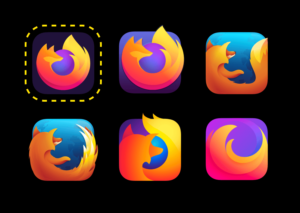
Where things get really interesting is when people explore breaking out of the squircle (which you can do on macOS) to provide some dimension to their icon. For example, here’s Firefox:

At first glance the existing firefox icon is the best as the squircle is near invisible against the current elements. However, it really is a trick on the eye. The second icon is delightful though really leaning into the fox and how the fire tail comes out of the icon. <3
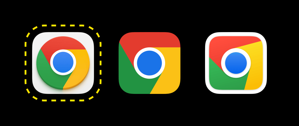
For example, as I browsed the wonderful macosicons.com gallery, I came across these alternatives for Chrome (the original from Google is on the far left, outlined in yellow):

I think chrome radial doesn't do well in a squircle. However, I also admit that the explorations are far more interesting than the current one Chrome's shipping.
Member discussion